2 releases
| 0.1.1 | Dec 21, 2024 |
|---|---|
| 0.1.0 | Jan 23, 2024 |
#1062 in Web programming
84 downloads per month
12KB
56 lines
🔝 Yew Scroll
⚠️ Warning: This crate has been moved to
scroll-rs. Please usescroll-rsinstead ofyew-scroll.

📜 Introduction
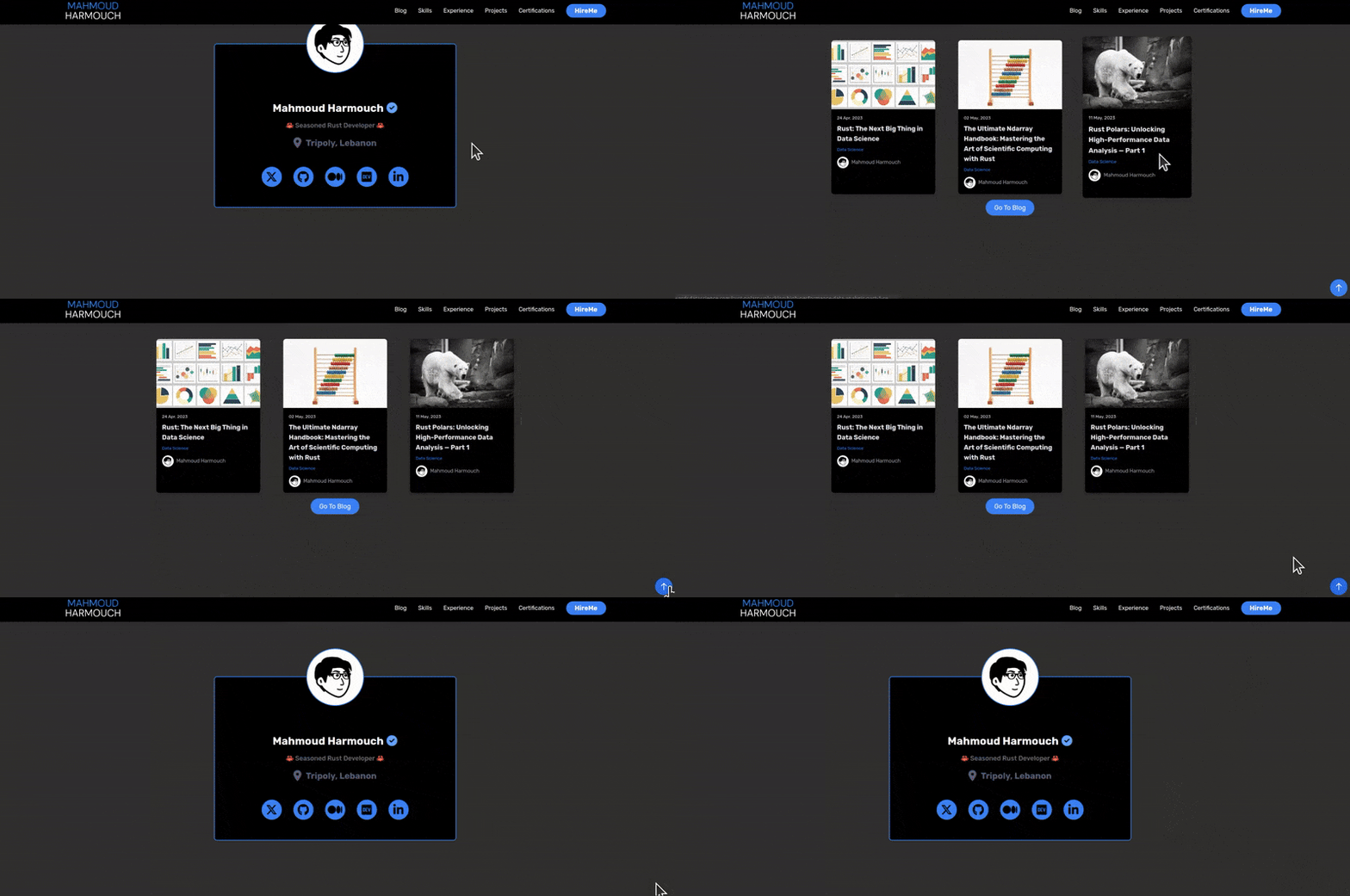
This component is designed to provide a convenient and customizable solution for implementing a "scroll to top" button in your Yew applications. Enhance user experience by allowing them to easily navigate to the top of the page with a single click.
🤔 Why is this Component Useful?
This component comes with several benefits that make it an essential addition to your Yew projects:
-
🔄 Scroll Navigation: Simplify user navigation by adding a convenient button to scroll smoothly to the top of the page.
-
🎨 Customization: Tailor the appearance of the "scroll to top" button using custom CSS classes, and provide a personalized SVG icon.
-
📏 Customizable Offset: Define a custom vertical offset (Y position) to trigger the visibility of the button, ensuring a seamless user experience.
⚙️ Installation
Integrating this component into your Yew project is a straightforward process. Follow these simple steps:
-
Make sure you have Yew set up in your project. If not, refer to the Yew documentation for installation instructions.
-
Install the component package using your preferred package manager:
$ cargo add yew-scroll -
Import the component into your Yew application and start using it to improve user navigation.
🛠️ Usage
Incorporating this component into your application is easy. Follow these steps:
-
Import the component and its required dependencies:
use yew-scroll::{ScrollToTop, ScrollToTopProps}; -
Set up the props for the
ScrollToTopcomponent:// Custom SVG content for the scroll-to-top button (an arrow). fn custom_svg() -> Html { html! { <svg class="w-6 h-6" fill="none" stroke="currentColor" viewBox="0 0 24 24" xmlns="http://www.w3.org/2000/svg" > <path stroke-linecap="round" stroke-linejoin="round" stroke-width="2" d="M5 10l7-7m0 0l7 7m-7-7v18" /> </svg> } } // Custom SVG content for the scroll-to-top button (an arrow). #[function_component(MyComponent)] pub fn my_component() -> Html { // Set props for the `ScrollToTop` component let custom_props = ScrollToTopProps { css: "custom-css", // Add any custom CSS classes top_offset: 0.0, // Set the desired top offset value to show the button svg_content: custom_svg(), // Provide custom SVG content }; // Render the `ScrollToTop` component with the specified props html! { <> // Other content in your component <p>{"Scroll down to see the button"}</p> // Use the scroll_to_top component <ScrollToTop ..custom_props /> // Default Usage <ScrollToTop /> </> } } -
Customize the appearance and behavior of the "scroll to top" button based on your project requirements.
🔧 Props
| Name | Type | Description | Example | Default Value |
|---|---|---|---|---|
css |
&'static str |
Custom CSS classes for styling the button. | "custom-scroll-button", "highlight-button". | "fixed bottom-4 right-4 bg-blue-500 text-white p-3 rounded-full cursor-pointer hover:bg-blue-600 transition duration-300 ease-in-out" |
top_offset |
f64 |
The vertical offset value (Y position) to trigger button visibility. | 200.0, 300.0 | 500.0 |
svg_content |
Html |
Custom SVG content for the button. | custom_svg() |
default_svg() |
🤝 Contribution
We encourage contributions from the community to enhance this Yew component. Feel free to open issues, submit pull requests, or provide feedback. Let's collaborate and make this component even more powerful!
📜 License
The Scroll To Top Yew component is licensed under the MIT License, allowing you to use, modify, and distribute it freely. Refer to the LICENSE file for more details.
Dependencies
~11–20MB
~266K SLoC