3 releases
| 0.1.2 | Dec 23, 2024 |
|---|---|
| 0.1.1 | Feb 3, 2024 |
| 0.1.0 | Jan 28, 2024 |
#81 in No standard library
Used in 2 crates
17KB
95 lines
🎵 Yew Accordion
⚠️ Warning: This crate has been moved to
accordion-rs. Please useaccordion-rsinstead ofyew-accordion.
📜 Introduction
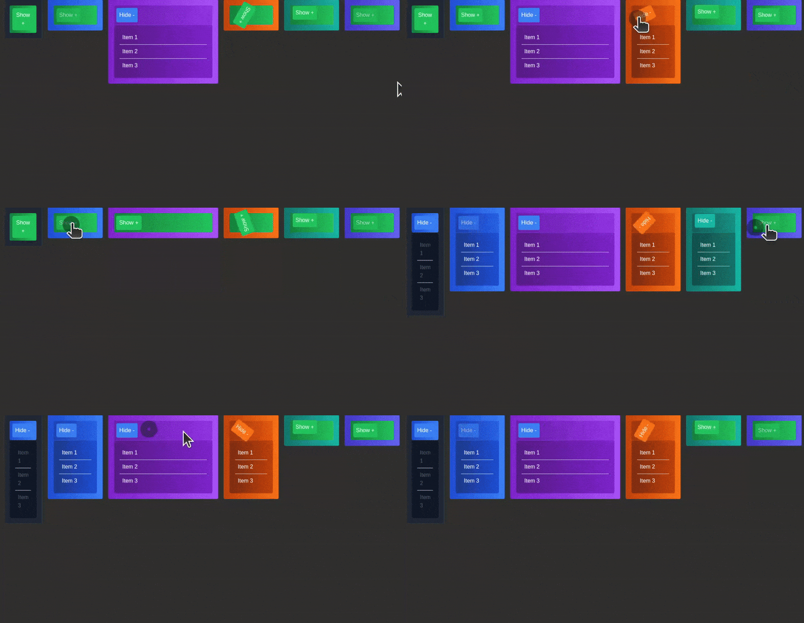
Yew Accordion is a simple and flexible accordion component for the Yew framework. It allows you to create collapsible content sections easily.
🤔 Why is this Component Useful?
The Accordion component offers several benefits to enhance your web application:
-
🌐 Customization: Tailor the appearance and behavior of the accordion to suit your application's design.
-
🚀 Responsive Design: Ensures optimal viewing and navigation across various devices and screen sizes.
-
💬 Easy Integration: Seamless integration into Yew projects with minimal setup and configuration.
⚙️ Installation
Integrating Yew Accordion into your Yew project is a straightforward process. Follow these steps:
-
Make sure you have Yew set up in your project. If not, refer to the Yew documentation for installation instructions.
-
Install the library using your preferred package manager:
$ cargo add yew-accordion -
Start using the Accordion component to enhance your application's content organization.
🛠️ Usage
Incorporating Yew Accordion into your application is easy. Follow these steps:
-
Import the Accordion component into your Yew project:
use yew::prelude::*; use yew_accordion::{Accordion, AccordionButton, AccordionItem}; #[function_component(App)] pub fn app() -> Html { html! { <Accordion expanded_element={html! {<AccordionButton class={"bg-blue-500 text-white p-2 rounded"}>{ "Hide -" }</AccordionButton>}} collapsed_element={html! {<AccordionButton class={"bg-green-500 text-white p-2 rounded"}>{ "Show +" }</AccordionButton>}} size="sm" aria_controls="example-accordion" container_class="my-custom-class bg-gray-800 p-4 rounded border border-gray-700" expanded_element_class="my-expanded-class bg-gradient-to-r from-blue-700 to-blue-500 text-white p-2 rounded" collapsed_element_class="my-collapsed-class bg-gradient-to-r from-green-700 to-green-500 text-white p-2 rounded" content_container_class="my-content-class bg-gray-900 p-4 rounded border-t border-gray-700" > <ul> <AccordionItem item_class="my-list-item-class border-b p-2 hover:bg-gray-700 transition duration-300 ease-in-out" >{ "Item 1" }</AccordionItem> <AccordionItem item_class="my-list-item-class border-b p-2 hover:bg-gray-700 transition duration-300 ease-in-out" >{ "Item 2" }</AccordionItem> <AccordionItem item_class="my-list-item-class p-2 hover:bg-gray-700 transition duration-300 ease-in-out" >{ "Item 3" }</AccordionItem> </ul> </Accordion> } } -
Customize the Accordion appearance and behavior using provided props.
-
Enjoy an enhanced content organization experience with Yew Accordion.
🔧 Props
| Name | Type | Default Value | Description |
|---|---|---|---|
expanded_element |
Html |
Html::default() |
Content to be displayed when the accordion is expanded. |
collapsed_element |
Html |
Html::default() |
Content to be displayed when the accordion is collapsed. |
children |
Html |
Html::default() |
Child elements within the accordion. |
size |
&'static str |
"" |
Size of the accordion. Possible values: "sm", "md", "lg". |
aria_controls |
&'static str |
"" |
ARIA controls attribute for accessibility. |
container_class |
&'static str |
"" |
Class for the container element. |
expanded_element_class |
&'static str |
"" |
Class for the expanded element. |
collapsed_element_class |
&'static str |
"" |
Class for the collapsed element. |
content_container_class |
&'static str |
"" |
Class for the content container. |
📙 Examples
If you're curious about how to use it with different styling or additional features, you can check out the examples folder for more information.
🤝 Contribution
We welcome contributions from the community to enhance this component. Feel free to open issues, submit pull requests, or provide feedback. Let's collaborate to make content organization in Yew even more straightforward and interactive!
📜 License
Yew Accordion is licensed under the MIT License, allowing you to use, modify, and distribute it freely. Refer to the LICENSE file for more details.
Dependencies
~11–20MB
~266K SLoC
