2 releases
| 0.1.1 | Dec 21, 2024 |
|---|---|
| 0.1.0 | Feb 3, 2024 |
#418 in Web programming
97 downloads per month
Used in next-rs
28KB
265 lines
⚠️ Yew Alert
⚠️ Warning: This crate has been moved to
alert-rs. Please usealert-rsinstead ofyew-alert.
📜 Introduction
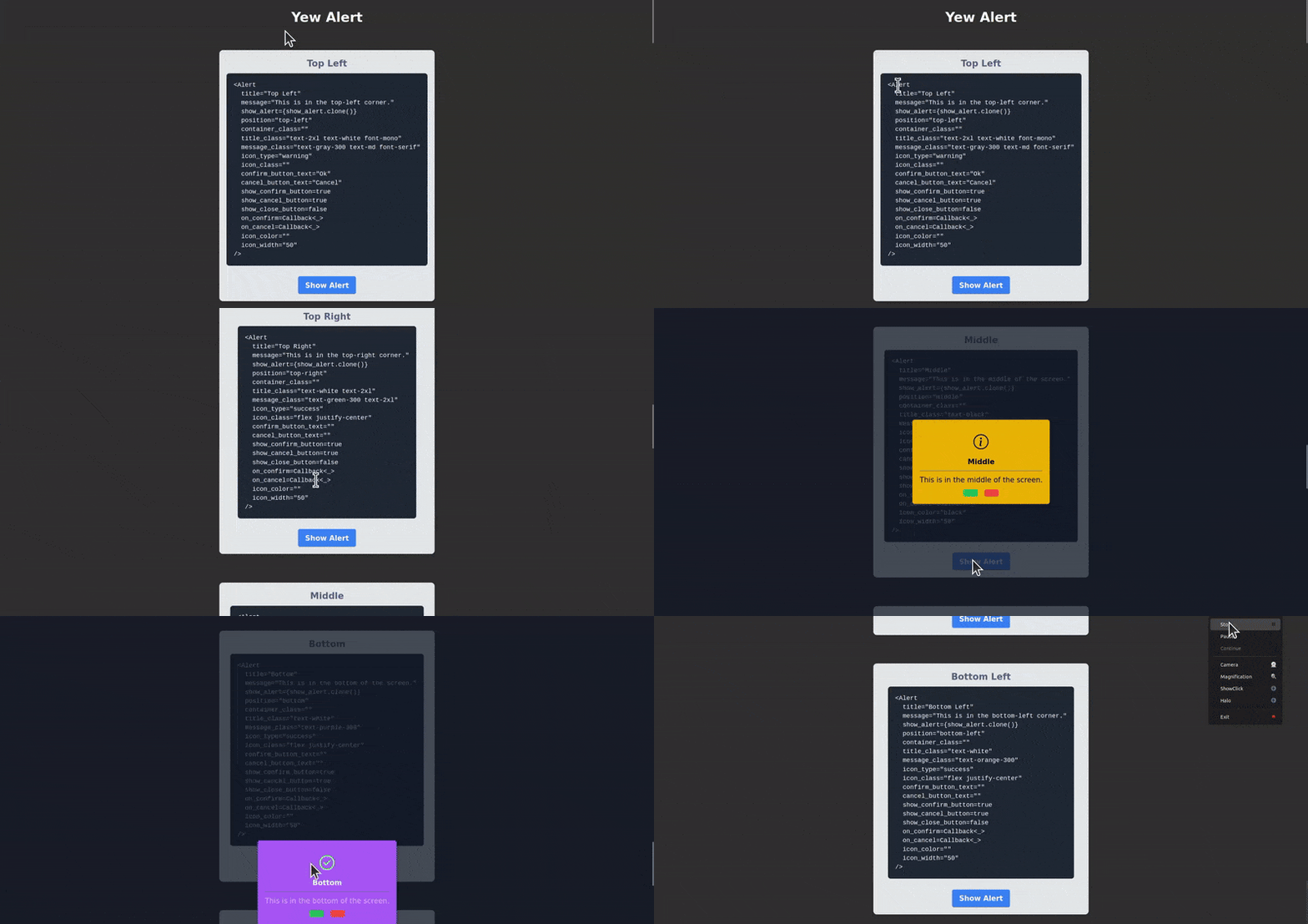
Yew Alert is a simple yet flexible alert component for the Yew framework, designed to provide customizable and responsive alerts to enhance user interaction.
🤔 Why is this Component Useful?
The Alert component offers several benefits to improve your web application:
-
⚙️ Customization: Tailor the appearance and behavior of alerts based on your application's design and requirements.
-
🚀 Responsive Design: Ensures optimal display and interaction across various devices and screen sizes.
-
💬 Easy Integration: Seamlessly integrate alerts into Yew projects with minimal setup and configuration.
⚙️ Installation
Integrating Yew Alert into your Yew project is straightforward. Follow these steps:
-
Make sure you have Yew set up in your project. If not, refer to the Yew documentation for installation instructions.
-
Install the library using your preferred package manager:
$ cargo add yew-alert -
Start using the Alert component to enhance your application's user feedback.
🛠️ Usage
Incorporating Yew Alert into your application is easy. Follow these steps:
-
Import the Alert component into your Yew project:
use yew::prelude::*; use yew_alert::Alert; -
Define the alert properties and use the Alert component in your Yew component:
#[function_component(App)] pub fn app() -> Html { let show_alert = use_state(|| true); html! { <Alert message={"This is an alert message"} show_alert={show_alert} timeout={2500} title={"Alert Title"} alert_class={"w-96 h-48 text-white"} icon_class={"flex justify-center"} confirm_button_text={"Okay"} cancel_button_text={"Cancel"} confirm_button_class={"bg-green-500 text-white rounded"} cancel_button_class={"bg-red-500 text-white rounded"} show_confirm_button={true} show_cancel_button={true} show_close_button={true} on_confirm={Callback::noop()} on_cancel={Callback::noop()} position={"top-right"} container_class={"flex items-center text-center justify-center bg-gray-800 text-white border border-gray-600"} title_class={"dark:text-white"} message_class={"dark:text-gray-300"} icon_type={"success"} icon_color={""} icon_width={"50"} /> } } -
Customize the Alert appearance and behavior using provided props.
-
Enjoy enhanced user feedback with Yew Alert.
🔧 Props
Main Props
| Name | Type | Default Value | Description |
|---|---|---|---|
message |
&'static str |
"" |
The message content of the alert. |
show_alert |
UseStateHandle<bool> |
UseStateHandle::new(false) |
State to control the visibility of the alert. |
timeout |
u32 |
2500 |
The duration in milliseconds before the alert automatically closes. |
title |
&'static str |
"Info" |
The title of the alert. |
Style and Layout Props
| Name | Type | Default Value | Description |
|---|---|---|---|
alert_class |
&'static str |
"w-96 h-48 text-white" |
The class applied to the alert container. |
icon_class |
&'static str |
"flex justify-center" |
The class applied to the icon container. |
Button Props
| Name | Type | Default Value | Description |
|---|---|---|---|
confirm_button_text |
&'static str |
"Okay" |
The text displayed on the confirm button. |
cancel_button_text |
&'static str |
"Cancel" |
The text displayed on the cancel button. |
confirm_button_class |
&'static str |
"bg-green-500 text-white rounded" |
The class applied to the confirm button. |
cancel_button_class |
&'static str |
"bg-red-500 text-white rounded" |
The class applied to the cancel button. |
show_confirm_button |
bool |
true |
Determines whether the confirm button is shown. |
show_cancel_button |
bool |
true |
Determines whether the cancel button is shown. |
show_close_button |
bool |
true |
Determines whether the close button (x) is shown. |
Positioning and Layout Props
| Name | Type | Default Value | Description |
|---|---|---|---|
position |
&'static str |
"top-right" |
The position of the alert on the screen. Possible values: "top-left", "top-right", "middle", "bottom", "top", "bottom-right", "bottom-left". |
container_class |
&'static str |
"flex items-center text-center justify-center bg-gray-800 text-white border border-gray-600" |
The class applied to the outermost container of the alert. |
title_class |
&'static str |
"dark:text-white" |
The class applied to the alert title. |
message_class |
&'static str |
"dark:text-gray-300" |
The class applied to the alert message. |
Icon Props
| Name | Type | Default Value | Description |
|---|---|---|---|
icon_type |
&'static str |
"success" |
The type of icon to be displayed. Possible values: "warning", "error", "success", "info", "question". |
icon_color |
&'static str |
"" |
The color of the icon. If empty, a default color is used based on the icon type. |
icon_width |
&'static str |
"50" |
The width of the icon. |
📙 Examples
Explore different styling and features in the examples folder.
🤝 Contribution
We welcome contributions from the community to enhance this component. Feel free to open issues, submit pull requests, or provide feedback. Let's collaborate to make user interaction in Yew even more dynamic and user-friendly!
📜 License
Yew Alert is licensed under the MIT License, allowing you to use, modify, and distribute it freely. Refer to the LICENSE file for more details.
Dependencies
~11–20MB
~265K SLoC
